Veritas design systems contribution

I had the opportunity to research and design a modal component and add it to Udacity’s design system, Veritas. I helped create the symbol component for the Veritas Sketch library and worked with a design systems engineer who helped code it.
Modals (or some people like to call them dialogues) are an amazing and powerful UI component in the right circumstances, but it’s important to understand when to use them.
I started by reading up on best practices to get a general sense of the do’s and dont’s of modals. There were plenty of articles to go through, notably one from the Nielson Norman Group on Modal & Non-modal Dialogues.
Here’s what I distilled down: modals help bring undivided focus to an action or piece of content, and helps prevent losing context or place in the overall page by opening something on a layer above.
Before even starting the design, I wanted an audit of all the modals we were using in our current products. Luckily, the design systems team at Udacity had already done an audit of many of the different components, including modals.
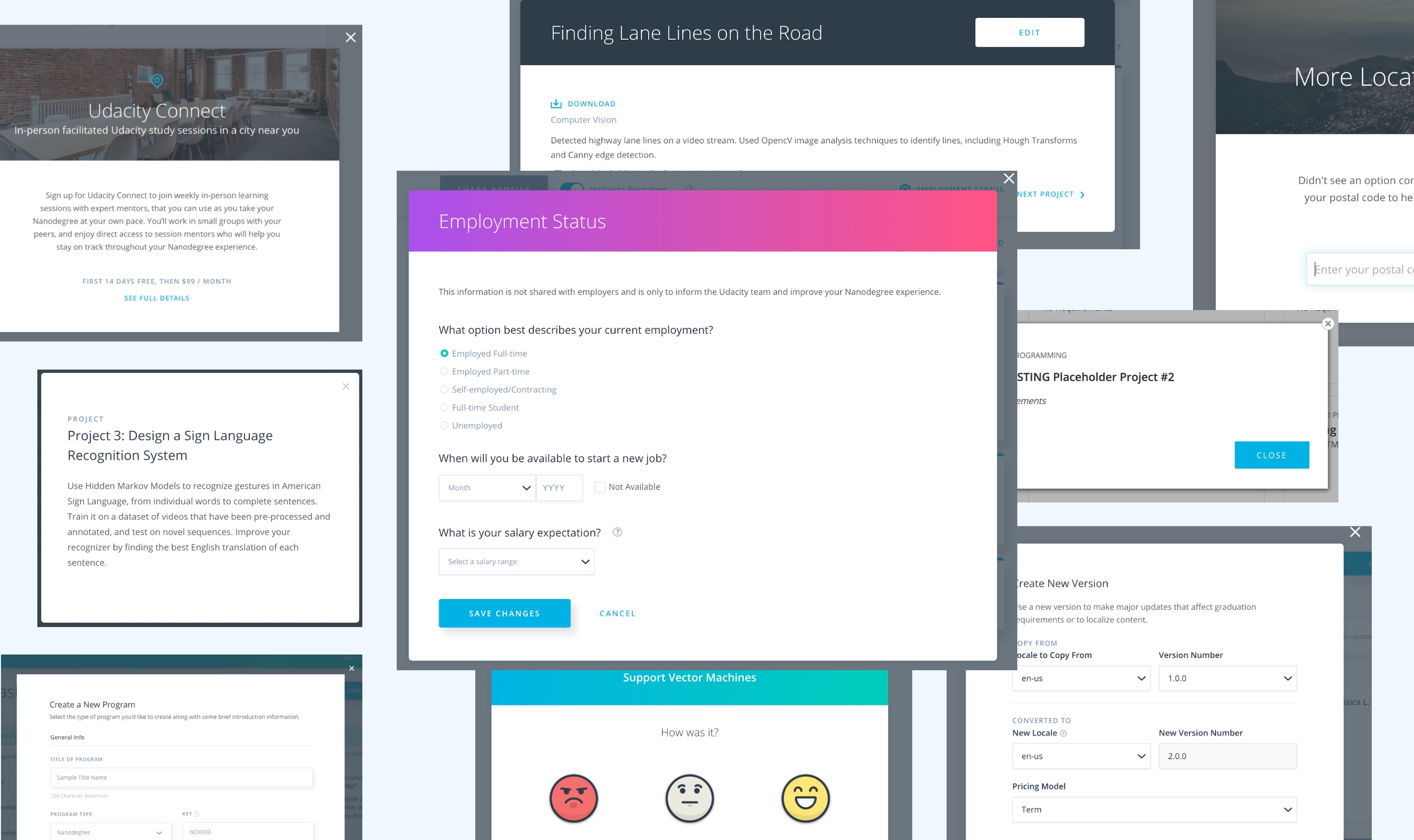
Crazy! There was such a dizzying array of modal layouts and it was really interesting to see the variety. While I needed to be considerate of what we were already using, I wanted to keep in mind that we can actually use this modal component to encourage new, better usage.
In addition to our personal audit, I had also taken a look at the modal component from other design systems such as Atlassian, IBM, and Quickbooks.
I had bounced back and forth between having more strict limitations on the modal versus having looser restrictions. Should title’s be required? Left align, center align, or both? Should we limit what components could be used in the modal body? Define the number of CTAs allowed? Define the positions of the CTAs? Based on feedback from other designers and the design systems team, I ended up going with something a little more flexible.
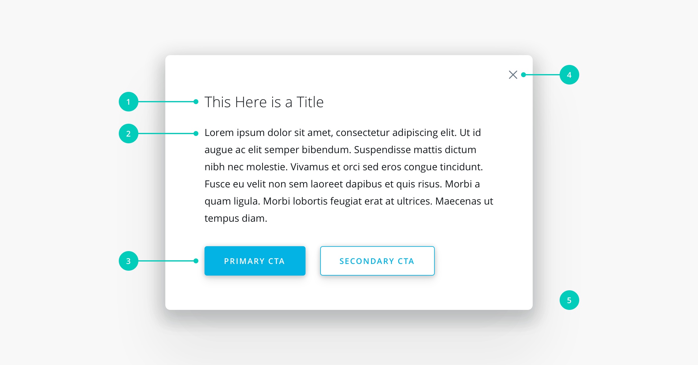
Headers contain things like the title and close button.
The body can contain anything like text or input boxes.
Footers contain CTAs. At least one CTA is required.
Close buttons always appear in upper right of the modal.
Blankets are a darkened layer beneath the modal to obscure the background and reduce distraction.
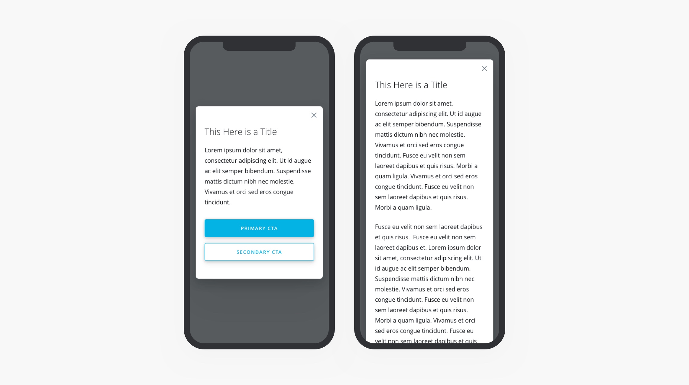
Mobile brings a additional set of challenges including how to handle extra long modals. I settled on designing a modal that would expand beyond the bottom of the screen instead of having a fixed header and footer. This would help us avoid double scrollbars and encourage designers to stick to concise modals.

Have a single purpose modal

Have multiple tasks in a modal that will distract users and cause them to navigate away without finishing the curent task
Have multiple modals open on top of one another
Because there were so few use cases where it made sense to use modals, I had also documented some modal alternatives.

Only partially covers screen, less intrusive

Information can be hidden and revealed in context

Instead of a confirmation modal, show an undo button

Open the content in a new tab to avoid losing your the place in the original page
Designing a component was an entirely eye-opening process. It gave me an opportunity to flex my systems thinking muscles by making me think deeply about a single component and it’s structure and use cases. Even though I had used the modal pattern for a long time in my career, there were new considerations that I learned through my research. I would be happy to do this again for other components. This modal component can be seen at the Veritas documentation site.