Student-powered Q&A resource

Knowledge was built for Udacity as a student-powered, scalable help service that allows students to find answers quickly and efficiently.
A major part of Udacity centers around getting students the help they need during their learning process. Over the years, we’ve built an impressive collection of help services, but the services offered were inconsistent between different online courses, and students were getting confused on what each help service was for. While each individual service had its benefits and disadvantages, we really needed an ecosystem that would work well together.
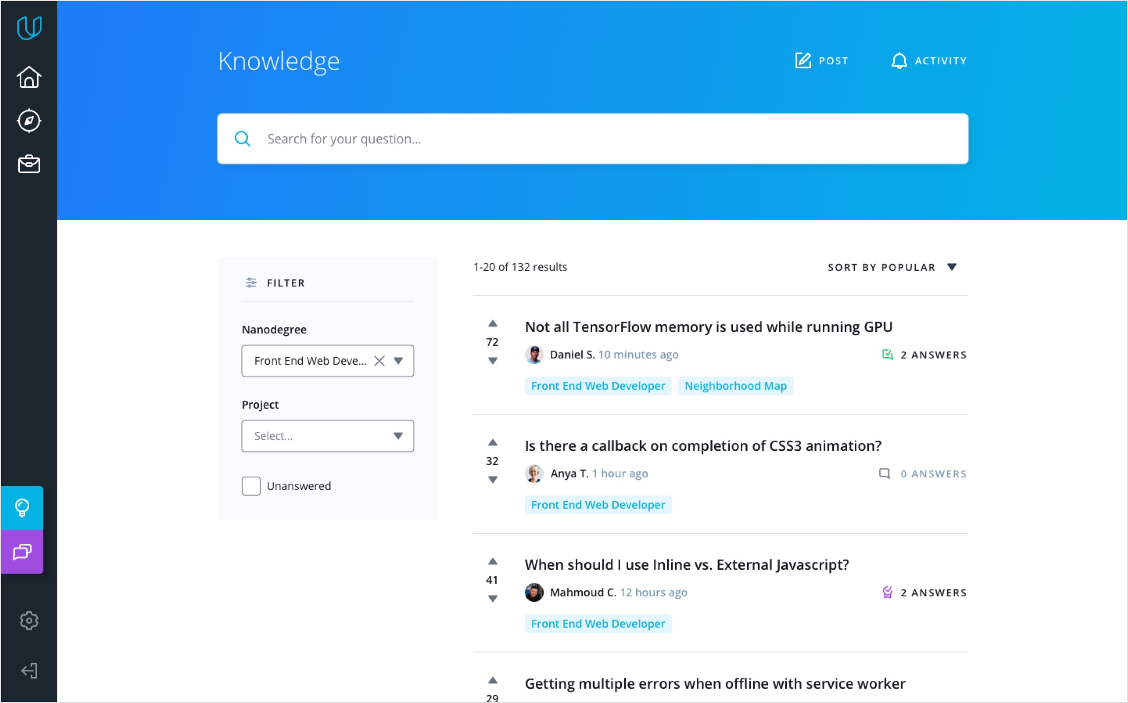
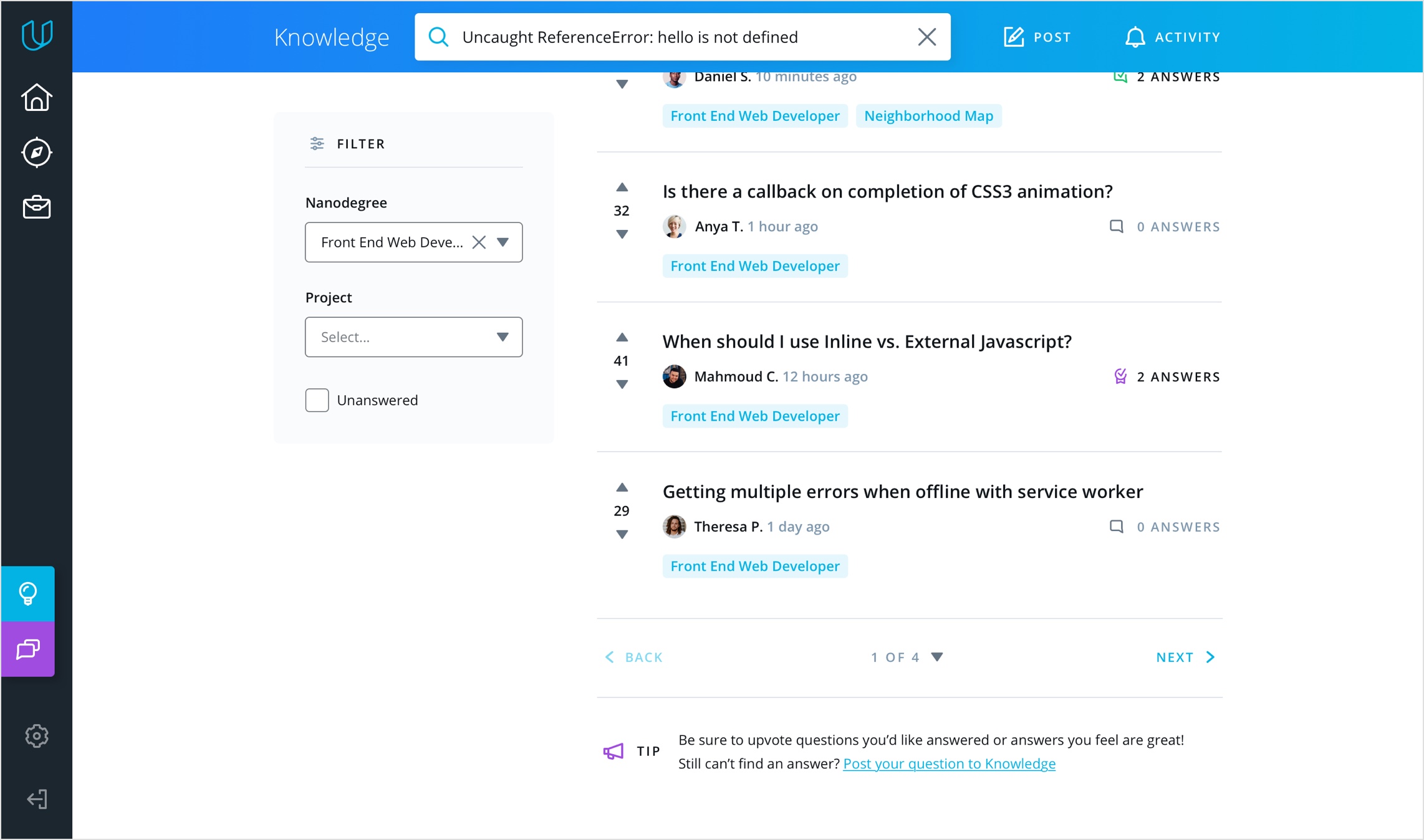
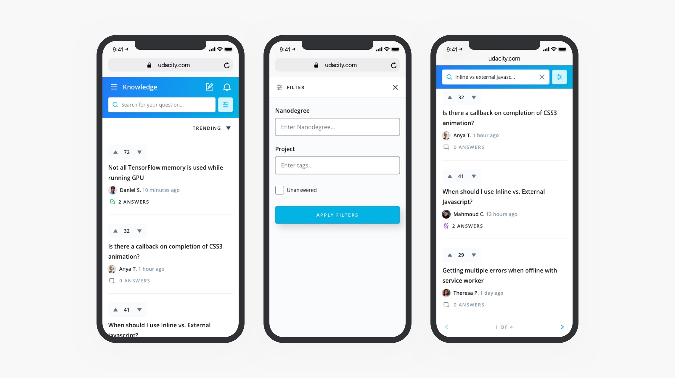
As an intial step to creating this simplified ecosystem, we decided to create a new Q&A site called Knowledge to replace forums. In this case study, I’ll be focusing on Knowledge home, which handled the search, sort, and filter features and the results display.
One PM, one engineering manager, two backend engineers, three frontend engineers, and me as the product designer
The project took about 4 months to launch
How, why, and when do students get help? Through some initial user interviews, we uncovered some interesting things that would help us make decisions as we were designing this out.
Students lose motivation quickly when they get stuck, so it’s important to unblock students as quickly as possible when they most need it. Immediacy is one of the top priorities for our students.
The majority of questions students have are technical. They are mostly related to projects, but quiz, concept, and general account questions do crop up too.
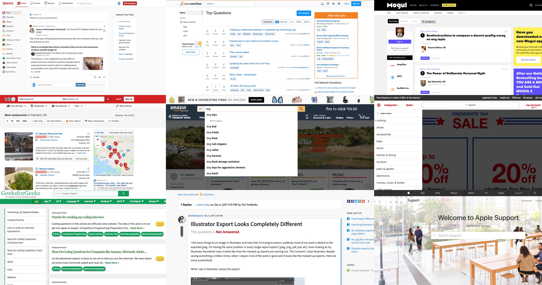
Additionally, I spent some time studying how other Q&A, forum, and retail sites handled things like searching, filters, sorting, displaying results, and engaging not just question askers, but question answerers.
Having done our initial research, I launched into ideation and refinement.
Throughout this process, I continued to bounce ideas between PMs and developers, and did some quick hallway tests or user testing sessions to answer questions and validate ideas.
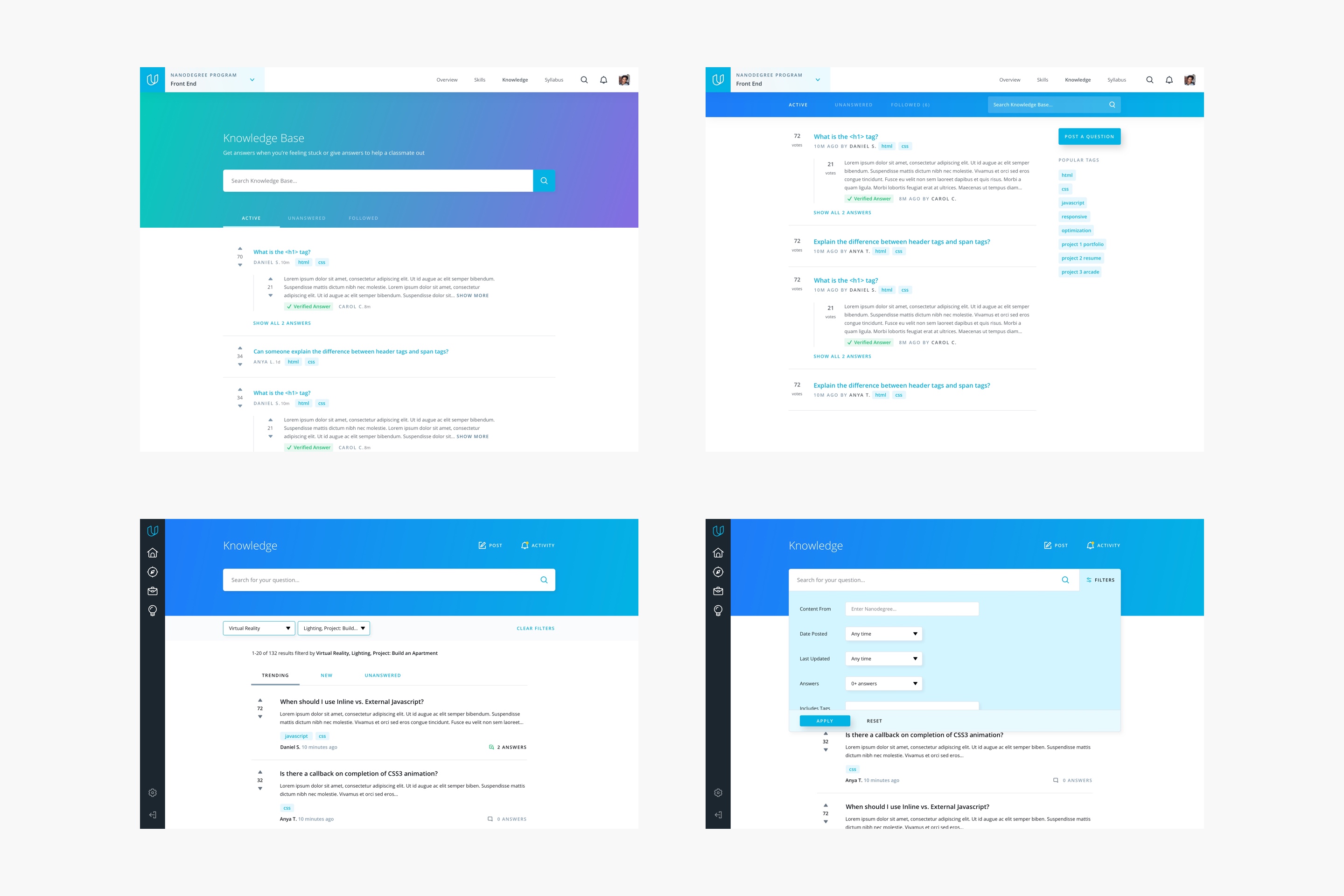
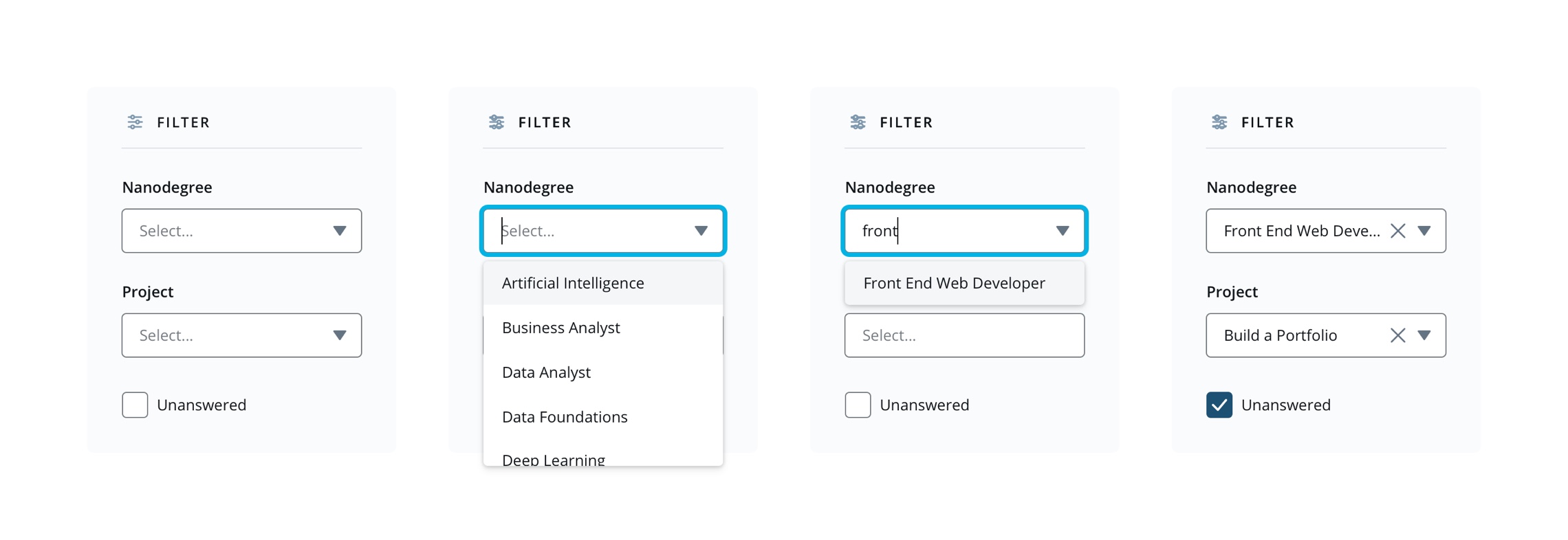
Searching is the primary action on the page, and filters, sorting, and tagging are all tools that help students organize content to deliver the most relevant results as quickly as possible.
Building a good rapport with the developers makes the launch process go much smoother. I learned to proactively reach out to front-end developers to get their feedback early on, and to work closely with them to design bug the build before it launched. While it was impossible address all bugs before launch, I learned to prioritize, stay diligent, and follow up afterwards to polish up the experience. We were able to stay aligned the entire way with no large surprises.
Knowledge was initially rolled out to our mentor community as a beta test, then slowly to our students. Four months after launch, there are about 3,200 questions asked on Knowledge, and about 75% of questions have been answered by students! While there were many things I wished we could have built and tested before launching, the MVP experience was a culmination of cross-functional teams collaborating together and have already helped improve the student experience.